2022
4 weeks
UX, UI, Website Design
Website design & Management
.webp)
Algorizin is a career bootcamp which helps International students in landing their first job through comprehensive training. They provide Project based technical skill learning facilities along with interview coaching for ensuring a tech job. They also excel in helping international students solve their immigration problems and become a permanent residence in the US.
Previous version of the website was build on WordPress. It was very laggy and not responsive. So the website stats were very poor. It wasn't generating enough sales. Algorizin was losing more and more leads. The website was unable to convert leads into paying customers. So website redesign had to happen in a very short time - to be exact four weeks!
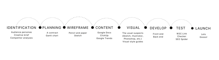
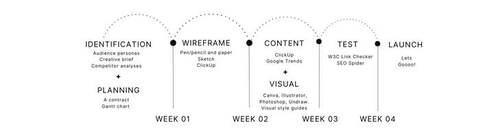
So I along with my small team decided to take on the initiative. We decided to switch to Webflow as it has every tool for a responsive website and that without coding. Because if we wanted to build the site it would've taken quite some time.
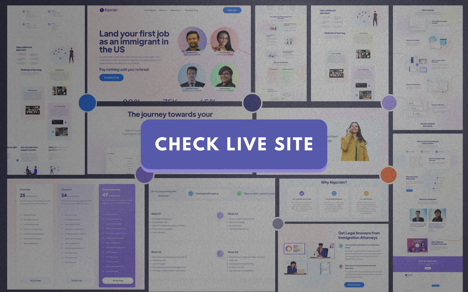
Website Design & Management
The first step was to study competitors' websites to gain empathy for users and to understand what type of structure, layout, and functionality are typical of those sites. We did a SWAT analysis of 12 different competitors. By identifying their strengths and weaknesses, we designed a better experience.
Then we looked at our previous website and it's data to have a better understanding of what worked and what didn't. We significantly improved on every aspect of the previous website's user interface and user experience.
Initially, we planned and mapped out how the final website might look. Our team developed an agile framework. This enabled us to take quick action and run project-related initiatives simultaneously. To accelerate the process, we researched, planned, and executed it simultaneously.
We identified key elements of previous website where we could improve upon the design and functionality of the website.
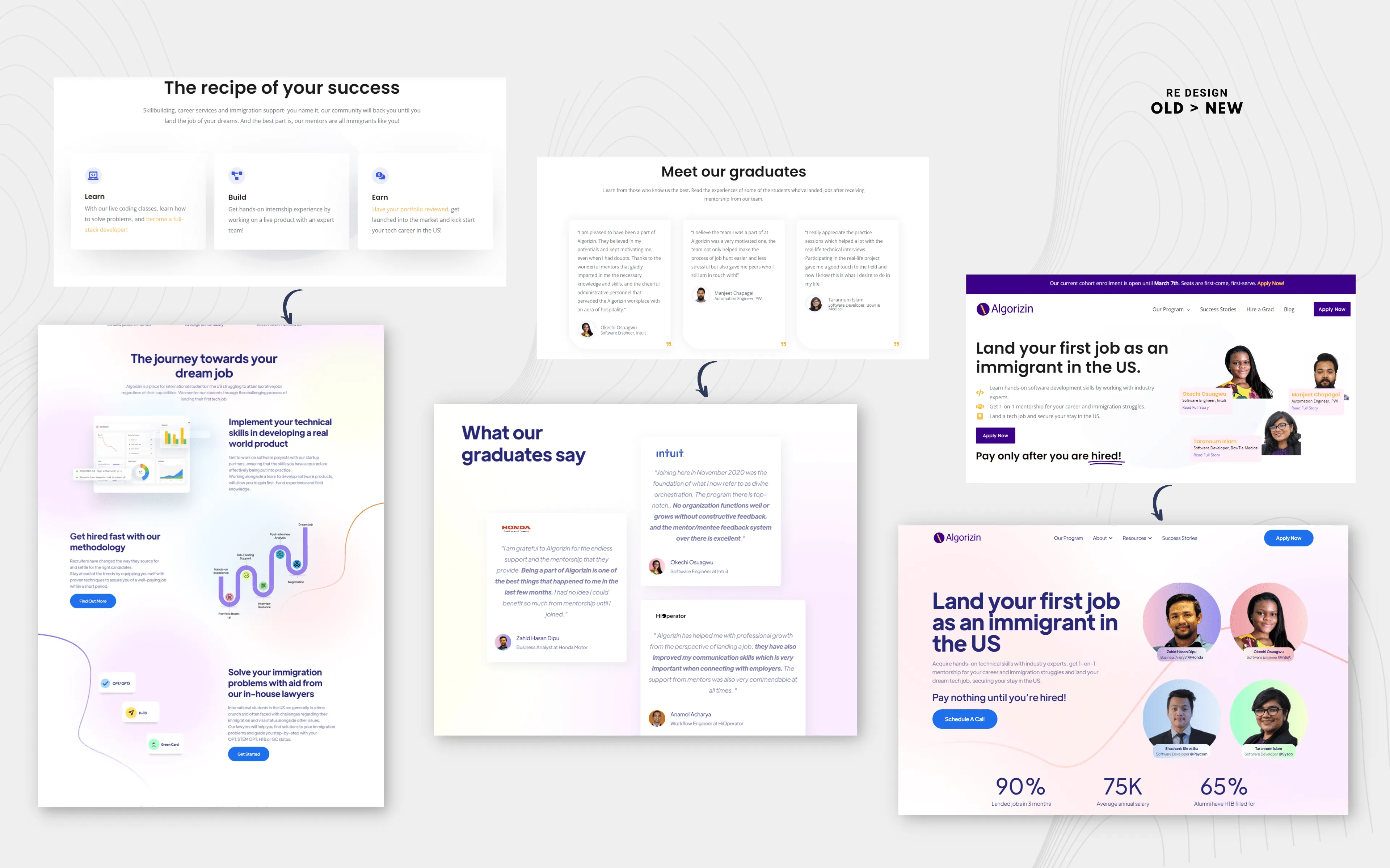
We also created robust section to covey our USP more directly to the users.
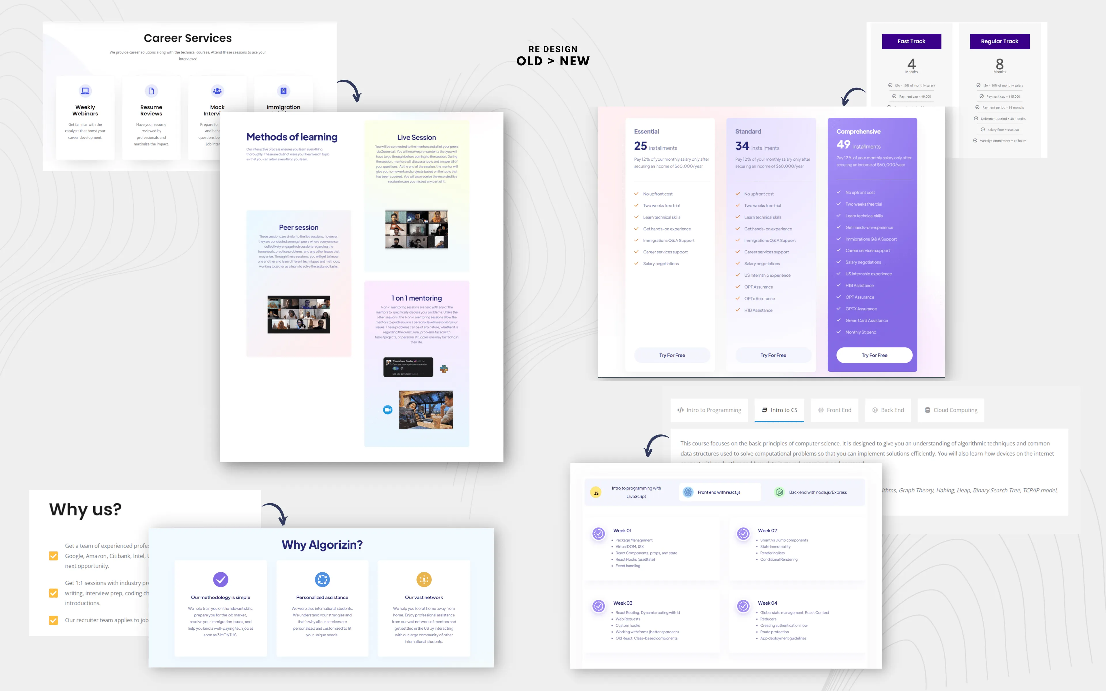
The initial structure of the site was simplified by grouping similar information onto one page and renaming menu items for more intuitive navigation.
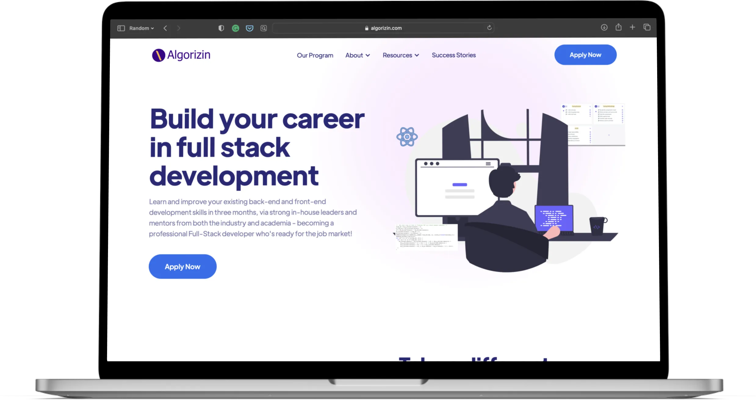
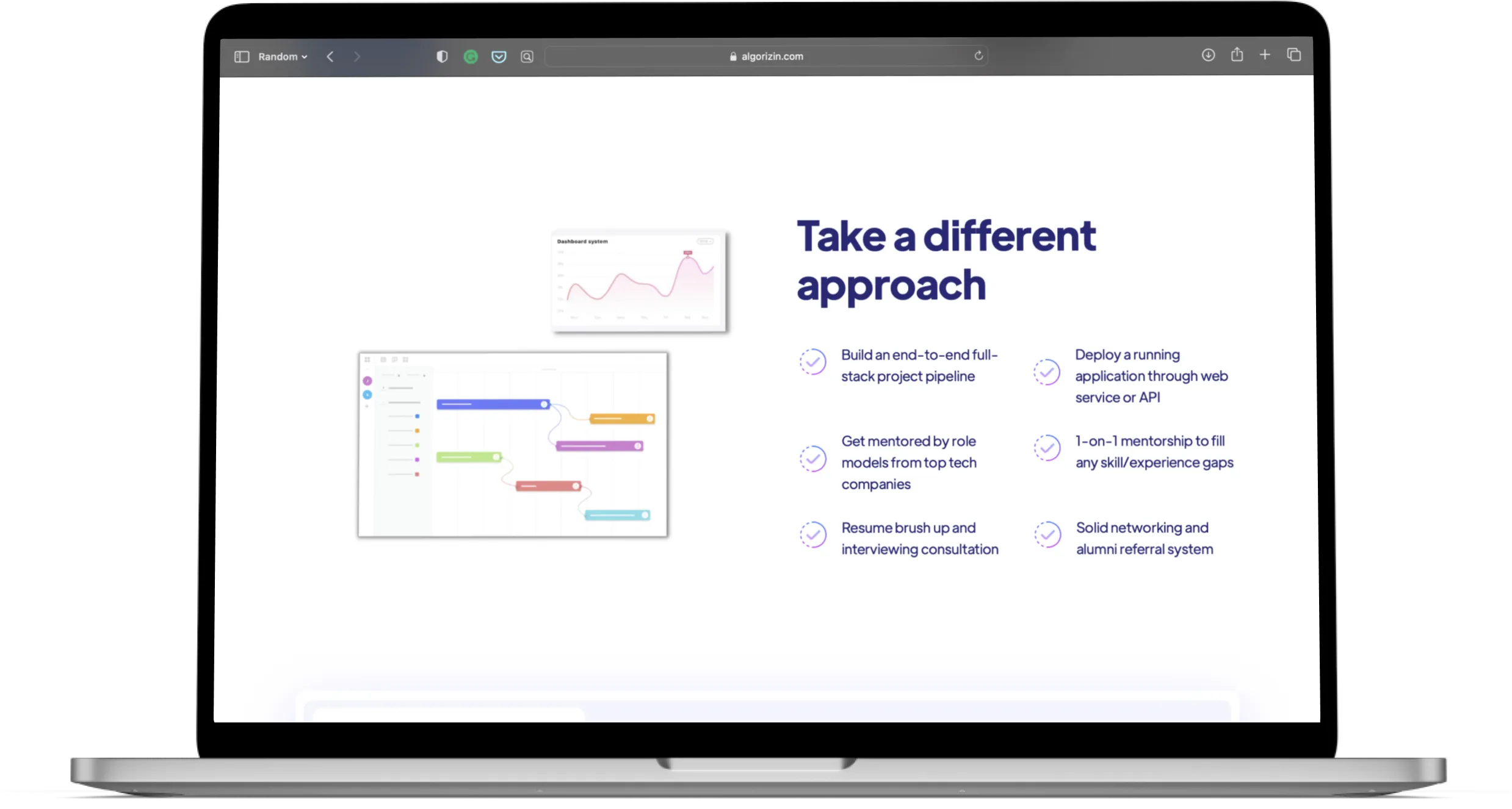
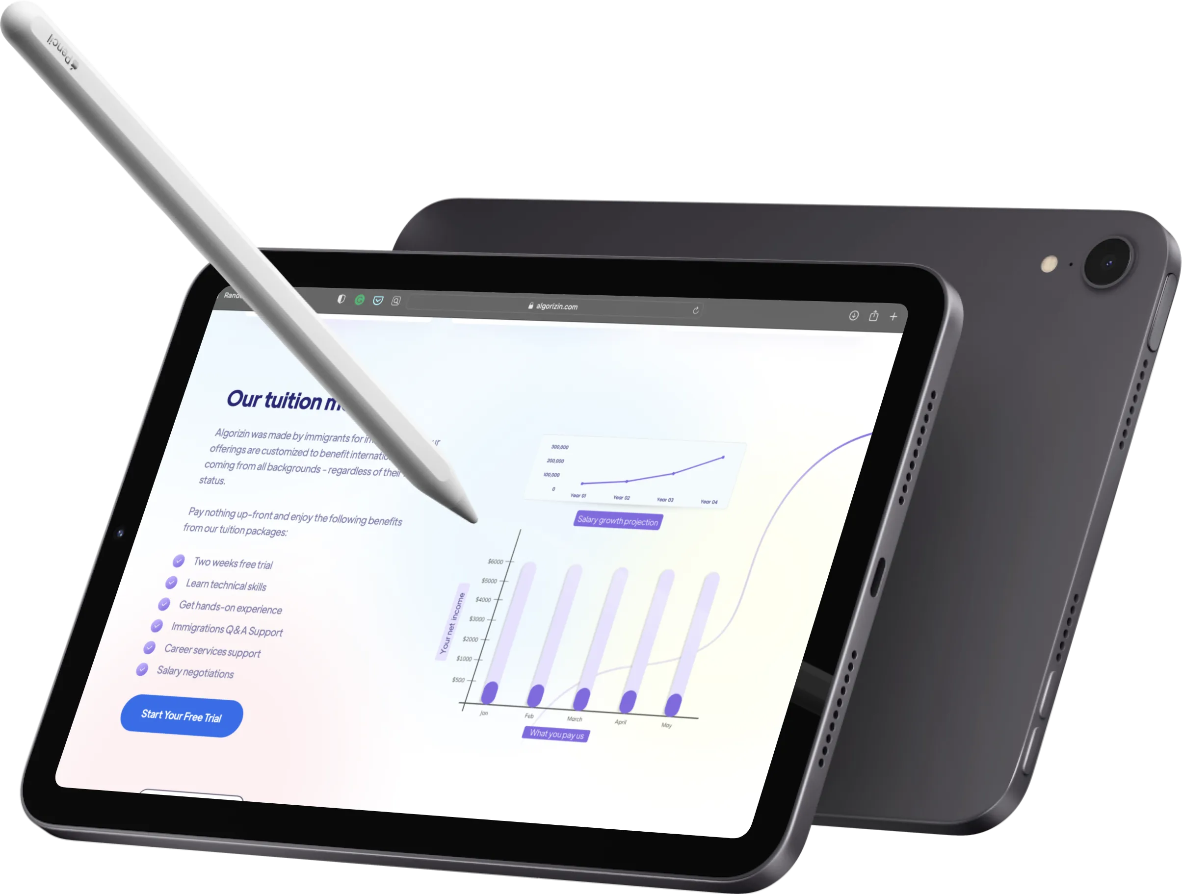
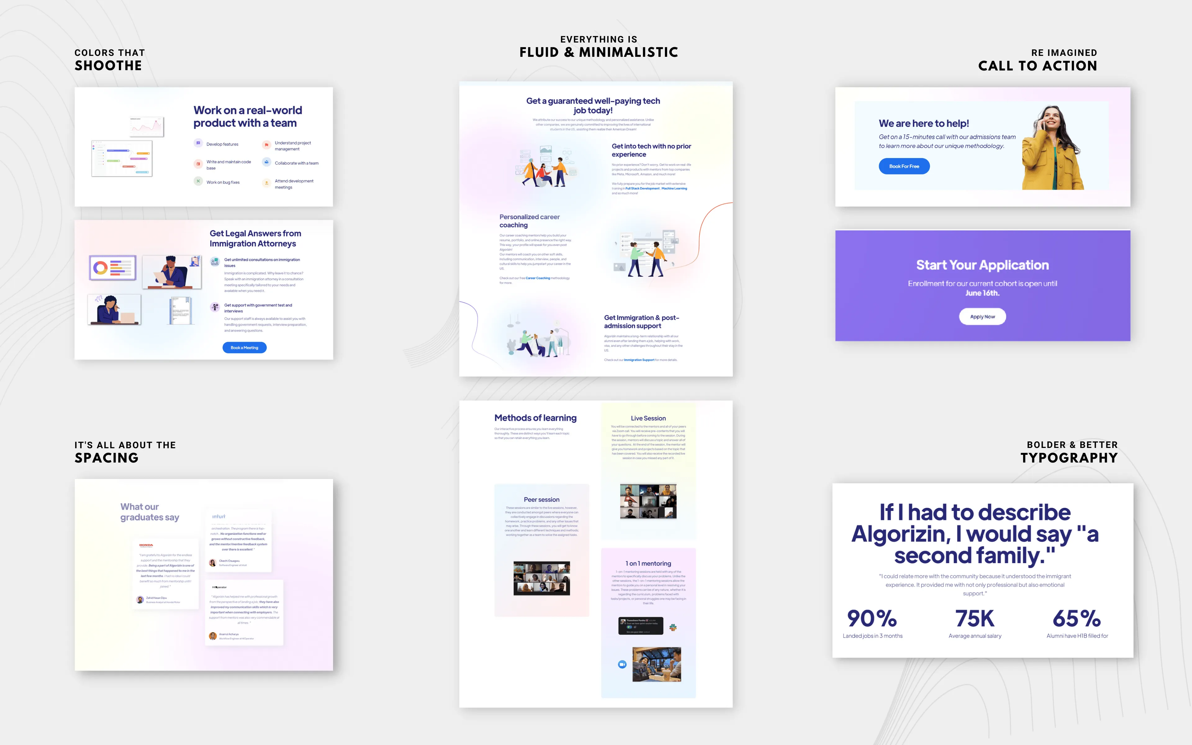
I went for bold typography and minimal use of colors and gradient to create the contrast.
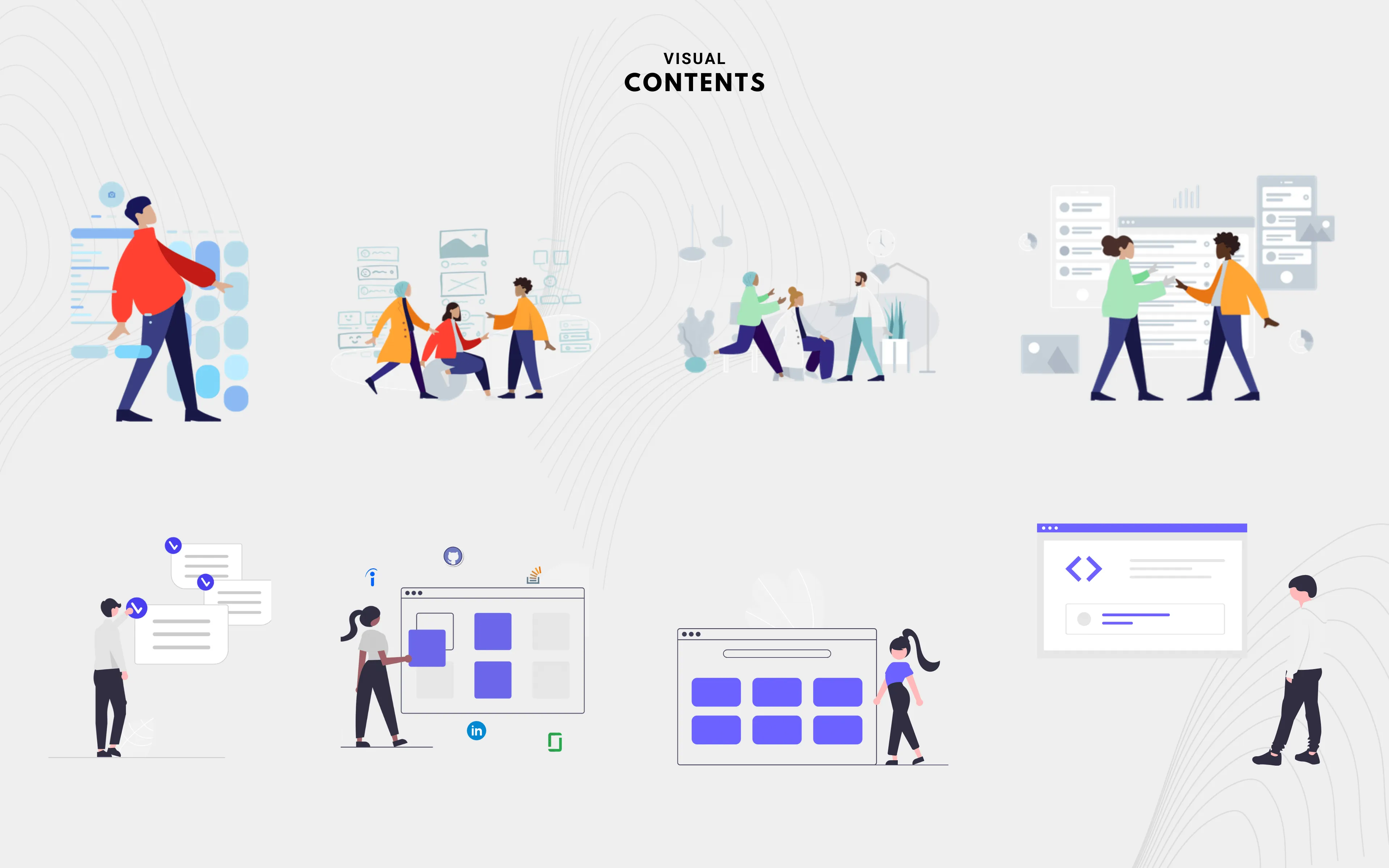
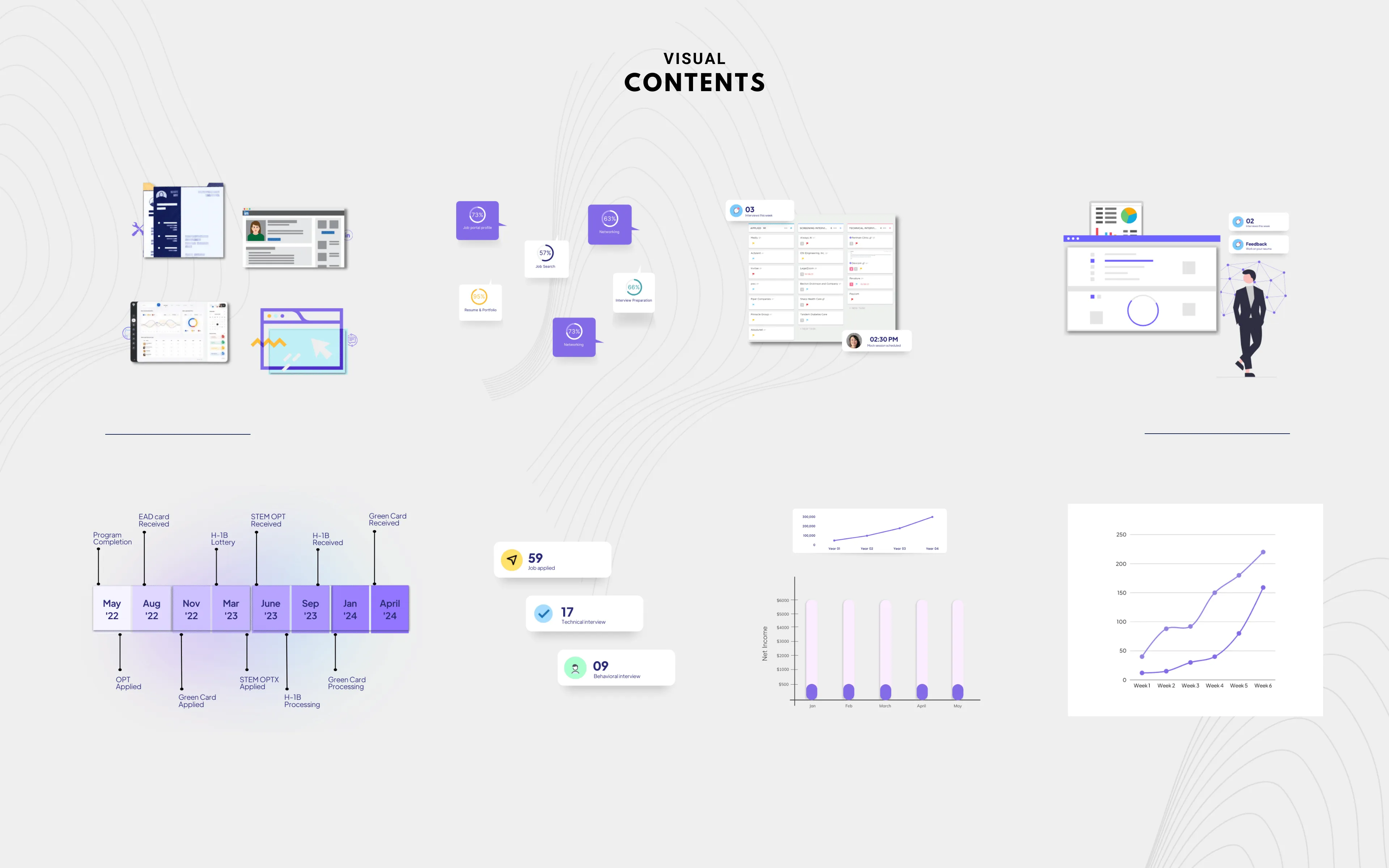
For the visual contents I went for minimal styling to complement bold typography style
I also wanted to convey information through our visuals so that people can understand our complex process just by looking at an image.
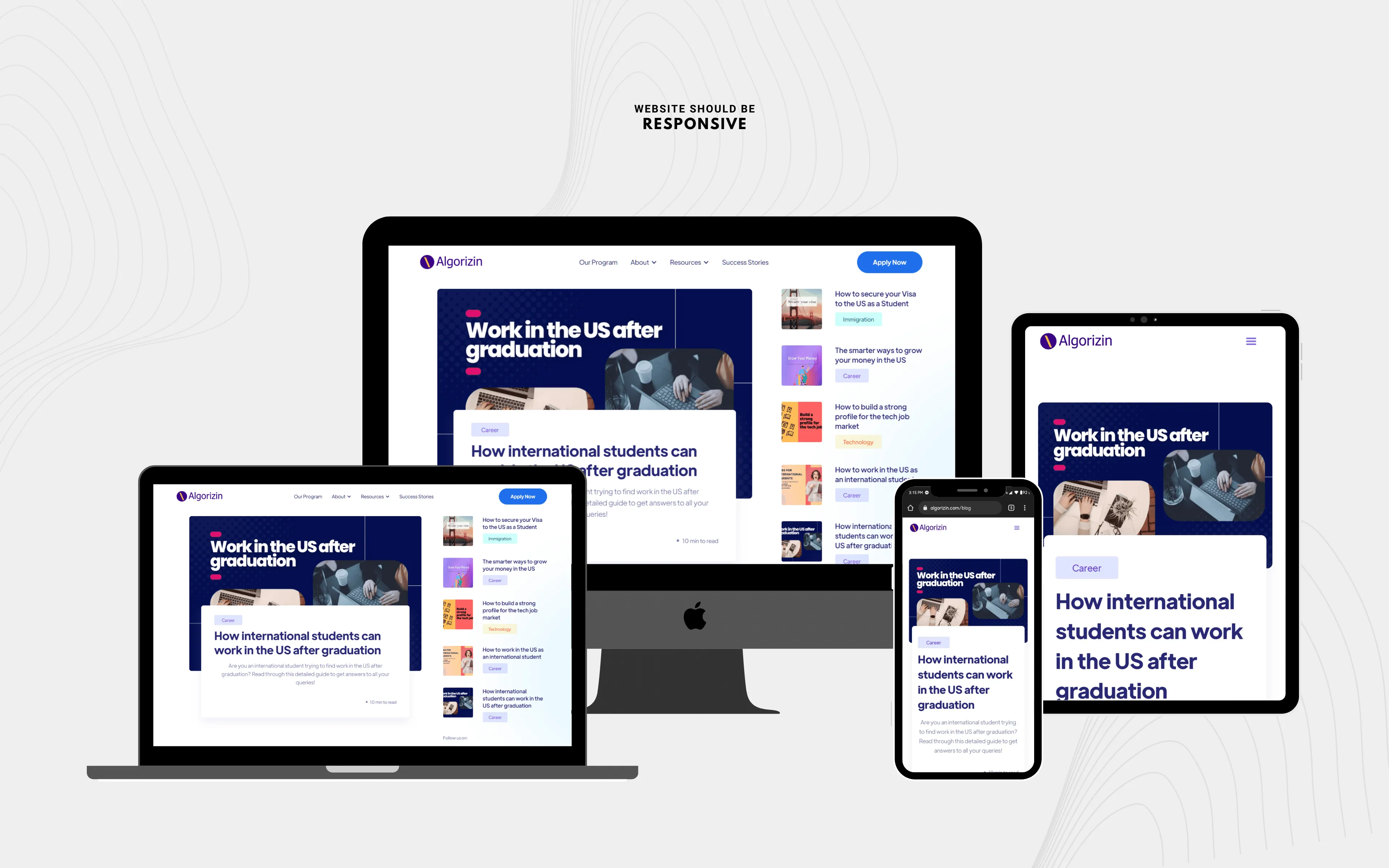
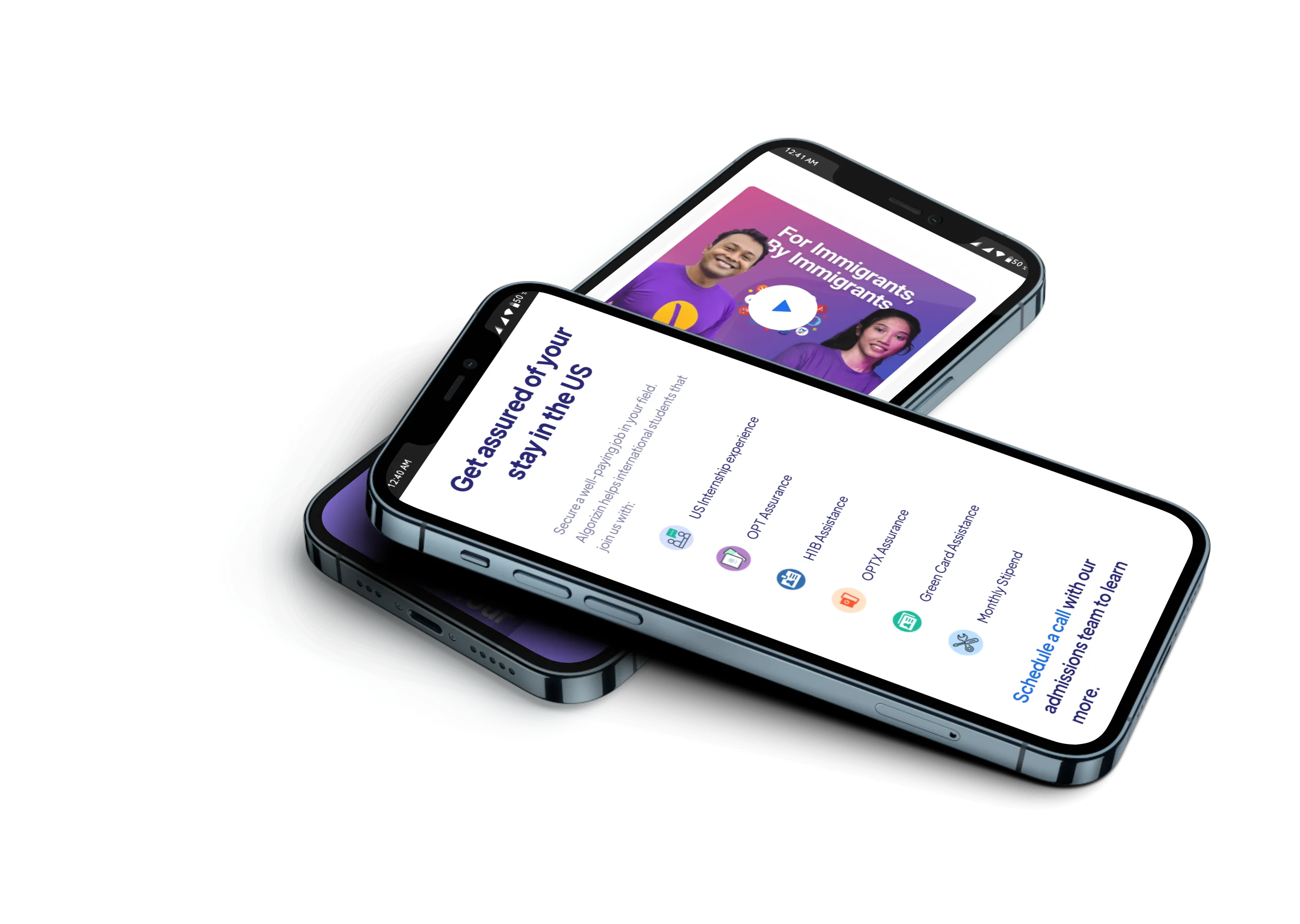
As 63% of our users are coming from mobile devices so I took mobile-first approach while designing.
By focusing on the quality of information instead of the quantity and approaching the design and UX with careful consideration of the end user, we were able to design a website that makes discovering and understanding the scientific community's opinion on relevant issues a straightforward and engaging experience.
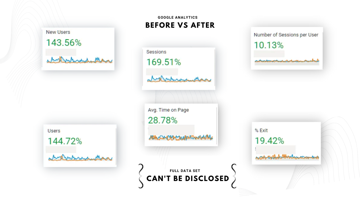
The results were outstanding. Every data set increased during the second quarter. We exceeded our expectations. We kept on researching, planning, and executing cycles throughout the whole quarter. And we got results that were vital for the whole company's growth.